This talk is brought to you in part by:
They pay me to do web development.
We're hiring apprentices for the spring terms!
That's next week.
That's the following week, and it will be covered by Open Source Club president Eli Gladman.
This talk is brought to you in part by:
They pay me to do web development.
We're hiring apprentices for the spring terms!
Go here in your browser now!
Once you have that open in your browser, open your browser's dev tools:
It's Cascading Style Sheets
A collection of styles, collected in a stylesheet. Styles describe how elements are displayed.
Styles are collected in stylesheets.
Cascading ... we'll cover that later.
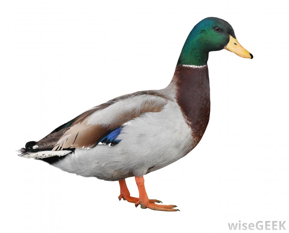
In the duck example. duck[flat] overrode the background-image property of duck. It's more specific than just plain duck.
In general:
Styles with more selectors override styles with fewer selectors:
Eleven!
Styles defined later override styles defined earlier:
Thirteen.
Properties marked !important override properties not !important
You should never use !important.
Note that !important does override more-specific selectors.
First, I'm going to recommend you read the W3C spec on how this works.
Styles come from three different origins:
<head>The browser sorts the styles in the following priority, highest to lowest:
Seriously.
Styles go in a separate file because of the separation of concerns: Separate content from presentation from functionality
Keeping styles separate from the page lets you update the entire site's styles by editing just one file.
If you ever hear someone calling for you to replace your CSS with JavaScript, they are telling a joke. Laugh as appropriate.
You have a style.css and you want to put it on the page.
The primary way is through a link tag:
<!DOCTYPE html>
<html>
	<head>
		<title>Intro to CSS</title>
		<link rel="stylesheet" href="css/style.css"/>
The important parts:
rel="stylesheet" tells the browser that the link is to be interpreted as a stylesheethref="css/style.css" tells the browser where the stylesheet is.<link> is a self-closing tag, so end it with a /.HTTP requests are so last week. We're putting everything inline now.
<!DOCTYPE html>
<html>
	<head>
		<title>Intro to CSS</title>
		<style>
html {
    color: blue;
}
h1 {
color: pink;
}
		</style>
Anything between <style> and </style> will be interpreted as a style that should be applied to the page.
We don't care about "separation of concerns" — it's outmoded.
<p style="color:green;">Green text</p>Green text
The style="" attribute can be applied to any element.
Inline styles make your HTML messy. They are a weapon of last resort, for when you need to verride every other style that might affect the element.
If you have to use them, you should feel sad.
Styles that you load in your page override the styles provided by your browser.
This is a p tag with default styles. It has emphasized content, bold content, italic content, underlined content, strong content, a span, and let's add an a tag for good measure.
This is a p tag with the class 'twelve'. It has emphasized content, bold content, italic content, underlined content, strong content, a span, and let's add an a tag for good measure.
Here's what the W3C has to say

Important things to remember:
Dotted, dashed, solid, groove, ridge, outset, inset.
Huh. Those last three solids are, in order: dotted, dashed, and solid. Let's play with the dotted borders, increasing the border-width by 10px each time.
And now with the dashed borders.
So borders get solid when they're really thick.
But what else can you do with borders?
By the power of borders, we can make little arrow things!
<a> elementsThe standard underline on links is boring.
Let's make the link bold, and have a red underline on hover.
How about a green dotted underline always? Lorem ipsum dolor sit amet, consectetur adipiscing elit. Donec a diam lectus. Sed sit amet ipsum mauris. Maecenas congue ligula ac quam viverra nec consectetur ante hendrerit. Donec et mollis dolor. Praesent et diam eget libero egestas mattis sit amet vitae augue. Nam tincidunt congue enim, ut porta lorem lacinia consectetur.
Sometimes that fat blue double underline needs to have breathing room. Therefore, you'll want to increase the line-height of the paragraph. Sed sit amet ipsum mauris. Maecenas congue ligula ac quam viverra nec consectetur ante hendrerit.
background is a fairly complex shorthand for the following properties:
background-attachment: If background-image is defined, controls whether the image scrolls with its container or stays fixed with the viewport.background-clip: Whether the background stays inside the margin, stays inside the border, or goes under the border to the margin.background-color: <color>: Can be a hex code, defined using RGB and alpha rgba(255,255,255,0.5) or Hue, Saturation, Lightness and alpha hsla(240, 100%, 50%, 1), or one of a bunch of proprietary extensions.background-image: Can be used to specify a number of images, stacked with the first image listed closest to the user. MDN is a good explainer on this.background-origin: Like background-clip, it defines where the background's reference for the position's 0,0 coordinate is: at the margin, the border, or the padding.background-position: Determines the position of the background image relative to the layer defined by background-origin.background-repeat: If the background-image is smaller than the viewport, does it repeat? Does it repeat vertically? Horizontally? Both? There are complex options that determine if and how the images scale to fit available space.background-size: Does the background require a fixed size? Should it distort to fit the aspect ratio of the element, or should it keep its old aspect ratio and have the leftovers clipped? Or should the whole background-image be visible and be letterboxed with background-color?If it sounds like I'm telling you to read the specifications, I am.
Mozilla Developer Network isn't the official specifications, but it's an excellent reference.
Don't use W3Schools. It's out-of-date, inaccurate, and not worth your time. It is the Yahoo Answers of coding resources.
Watch this 26-minute talk. It explains the origins of color names. It's ... interesting.
What are your questions?
You have an inkling of what CSS can do with images from the background property.


And that's why it's best to only set the height or width and not both.
However, feel free to leave both the width and height unset, and instead set the max-height and max-width properties on img in general. In this document, img { max-width: 100%; } is true, and that's why this 1000px-wide image doesn't overflow.

Generally speaking, iframe embed codes provided to you will have width and height parameters included in the code that you copy:
<iframe src="https://www.themarshallproject.org/next-to-die/embed/" style="overflow: hidden; width: 1px; min-width: 100%;" width="100%" height="400" frameborder="0" scrolling="no"></iframe>
If you strip that out, iframes will default to 150px by 300px or 100px bt 200px, in most browsers:
Chrome's useragent stylesheet includes a pretty-ugly border: 2px inset.
Here's a sane default style for iframes:
Remember that inline styles override styles set in your stylesheets.
Lists can be marked with many different markers:
cjk-ideographic format.You can even create inline lists:
(Use your browser's inspector to see how I did that one.)
Sometimes you want to display a table of data, and it comes out looking like this:
| Date | Tweet | Type | Ratio | |
|---|---|---|---|---|
| Sep. 11, 2015 | 642334607510228992 | news | 0 | |
| Sep. 11, 2015 | 642344398630559744 | news | 0 | |
| Sep. 11, 2015 | 642352012575817729 | news | 0 | |
| Sep. 11, 2015 | 642367471723409408 | opinion | 0 |
If you don't like how this table looks, check out the W3 wiki's article on styling tables and Edward-Tufte-inspired table designs. Remember that when it comes to styling tables, less is more.
// round images
// making things not-quite-round
Learning resources:
Play around with things on your own. Build a portfolio site. Use your browser's inspector tools to see how other people build their sites. See if you can reproduce that style.